to meet you
It's nice to meet you!

AUTOMATTIC MEETUP
DESIGN SYSTEM
IDENTITY | PRINT | DIGITAL
I’m a paragraph. Double click here or click Edit Text to add some text of your own or to change the font. Tell your visitors a bit about your services.
AUTOMATTIC MEETUP
DESIGN SYSTEM
IDENTITY | PRINT | DIGITAL
I’m a paragraph. Double click here or click Edit Text to add some text of your own or to change the font. Tell your visitors a bit about your services.
AUTOMATTIC MEETUP
DESIGN SYSTEM
IDENTITY | PRINT | DIGITAL
I’m a paragraph. Double click here or click Edit Text to add some text of your own or to change the font. Tell your visitors a bit about your services.
It's nice to meet you
to meet you
I'm a designer with a passion for brand, marketing & art direction

VISUAL DESIGN | BRAND SYSTEMS
WORDPRESS.COM
A new direction for
an established brand
Creative Director: Ashleigh Axios
Role: Creative Lead & Art Direction Team: Creative Studio
THE TASK
A NEW ARCHETYPE
In late 2018, after finishing a brand research project, Automattic wanted to create a new visual identity for WordPress.com based on those findings. Rather than diving directly into potential executions, the Creative Studio explored a few different brand archetypes. The outcome of this work was used as a guide for the final direction.
To tackle this project, we formed a team of 3 designers under the guidance of the Studio's Creative Director. Each designer was assigned a potential brand archetype for WordPress.com, informed by our most recent research. I chose to work on The Caregiver:


Our team met regularly to work through moodboards, values, and inspiration together, building up an extensive foundation before working on any visual designs. The Caregiver archetype is devoted to supporting our customer and making sure they feel confident and secure as they move through their website building journey.
I defined six core values of the Caregiver that would help guide the development of our visual aesthetic: Trustworthy, Supportive, Flexible, Personal, Enduring, and Exciting. These fit neatly into a brand "hierarchy of needs" pyramid, with Safety at the bottom, Belonging in the middle, and Self-Actualization at the top. This helped me map out the customer's emotional state, and understand what value was most important to evoke at each point of the brand experience.
Once our team worked through the values for each of our archetypes, we created mood boards and pulled visual, textural, color, and movement inspiration.


Since we work remotely, all our brainstorming, sticky-note-ing, and collabing happen virtually in places like the InVision boards above.
THE ELEMENTS OF A BRAND
PUTTING IT ALL TOGETHER
After a lot of exploration, we ultimately decided that the core feeling the Caregiver should evoke was safety and support:
We imagined cozy blankets on the couch or the feel of coming back after a long day and slipping on your favorite sweater. We wanted the user to get the feeling of "coming home" when they visit WordPress.com. What home means changes over time. It looks like so many different things to different people - but the feeling of going home is the same.
WordPress.com is that adaptability. We're always with you no matter where you are in you journey. Even as you upgrade and downgrade. Even if something doesn't work out. You can move out of one house and into another, but you're never without the feeling of home.
We believed once a user felt safe and secure in their choice of website builder, it gave them the foundation to move up that hierarchy of needs and take the risks required to realize their goals.
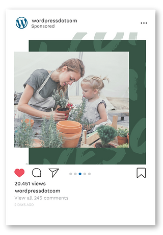
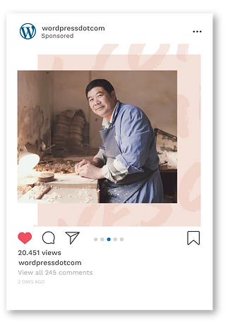
Visually we expressed this with warm colors, soft texture, and photography with lots of friendly eye contact and cozy spaces. This gave us the building blocks to create an identity that felt both welcoming and capable.
COLOR
BLUE: #34354B
WHITE: #FFFFFF
GREEN: #385445
PINK: #F6E4DE
BURGANDY: #623942
TAN: #D0A190
TYPOGRAPHY
Aa
ABCDEFGHIJKLMNOPQRSTUVWXYZ
abcdefghijklmnopvqrstuvwxyz
1234567890
PLAYFAIR DISPLAY - PRIMARY
Aa
ABCDEFGHIJKLMNOPQRSTUVWXYZ
abcdefghijklmnopvqrstuvwxyz
1234567890
OPEN SANS - SECONDARY
TEXTURE


PHOTOGRAPHY

For the actual executions, we explored how to bring together these elements in different digital environments. This included display and social ads, as well as landing pages.